kate
Objective
The rebranding of kate, a rising presence in the food and travel space was an opportunity to evolve a growing social media identity into a fully realized brand. The goal was to create a timeless and cohesive visual identity that could scale across platforms like Instagram and TikTok, while remaining flexible and emotionally resonant.
At the heart of the project was a desire to tell a deeper story: one of culinary discovery and global exploration. The challenge was to visually translate that spirit into a brand that was approachable, modern, and enduring. The final identity needed to feel both personal and universal one that could invite audiences in without overwhelming them.
Framework: Crafting a Narrative Through Minimalism
This rebrand was rooted in the idea that strong storytelling doesn't require excess just clarity and intention. I approached the project from a narrative-first perspective, working to build a brand system that spoke to kate’s values: curiosity, authenticity, and simplicity.
The process began with concept development, where I explored how visual elements could echo the brand’s story of culinary and travel exploration. I then led the visual design, developing a clean, elegant identity grounded in minimalist principles.
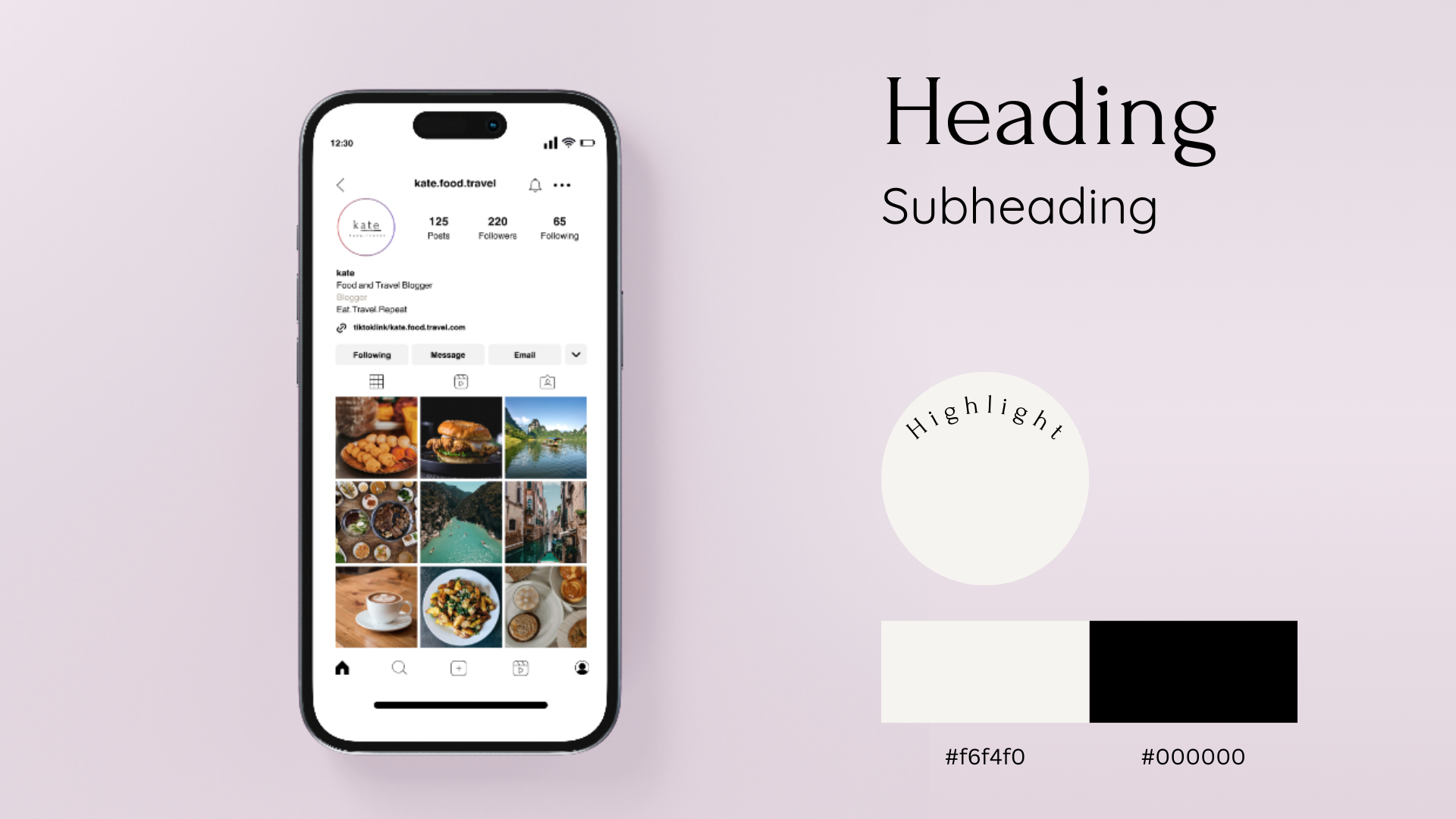
Typography played a central role in the narrative. I selected a typeface that struck a balance between sophistication and warmth mirroring the dual focus on refined culinary content and personal travel experiences. This typographic choice helped anchor the brand’s tone and ensure consistency across digital content.
Building from this foundation, I created a comprehensive design system including color palette, typographic hierarchy, and content templates optimized for social media platforms. The soft, natural color palette was chosen to reflect the organic nature of food and travel while maintaining visual calm in the fast-paced social media environment.
Throughout, I maintained a strong focus on content creation design, ensuring that visual elements enhanced storytelling rather than competing with it. The end result was a scalable, emotionally resonant brand identity that elevated kate’s presence while staying true to its voice.
Role
Concept & Narrative Development
Graphic Design
Brand Design & Typography
Content Creation Design
Client
kate